Festival Brand Redesign (Student Project)
Desn311- Branding and Identity Design
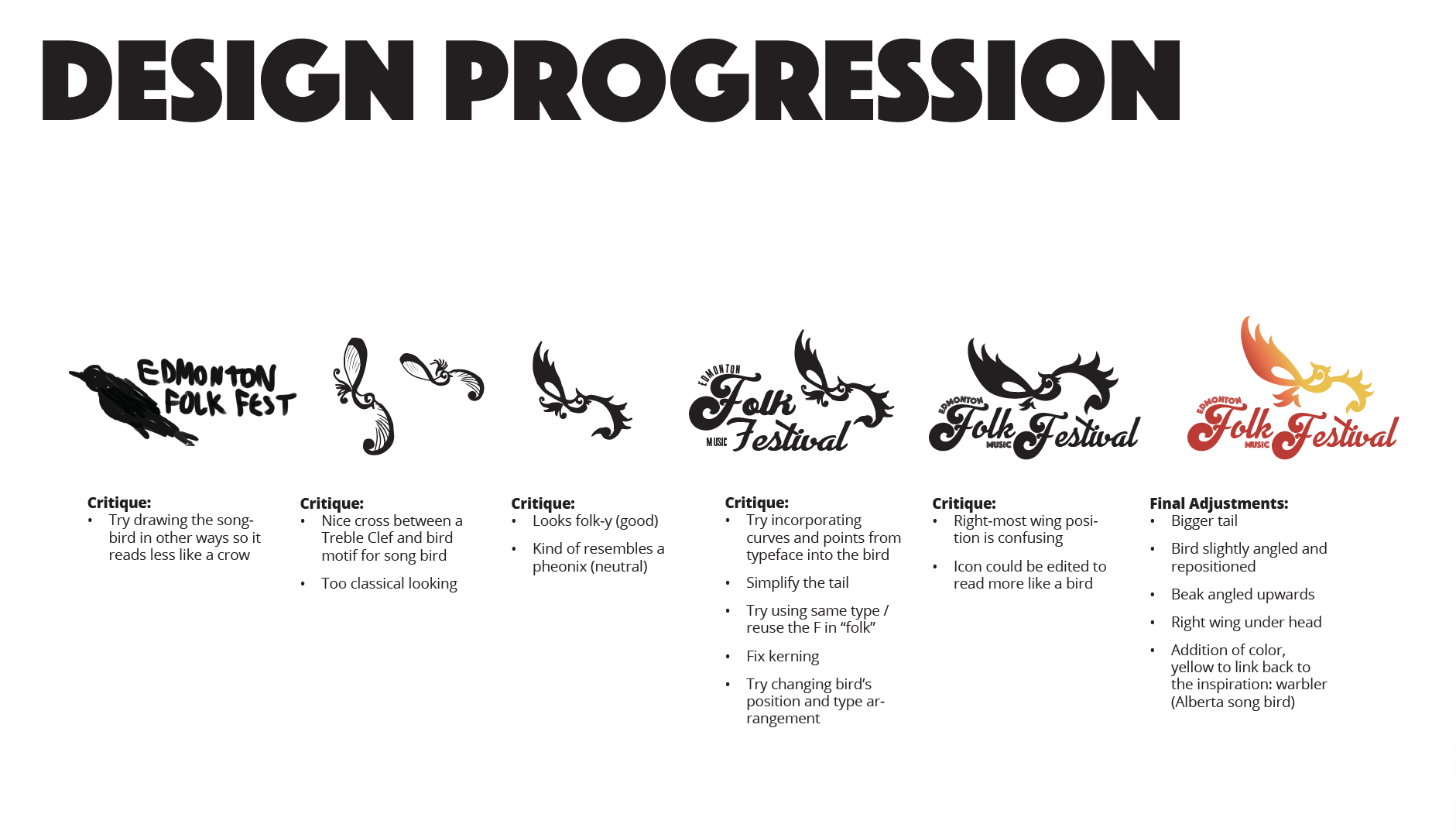
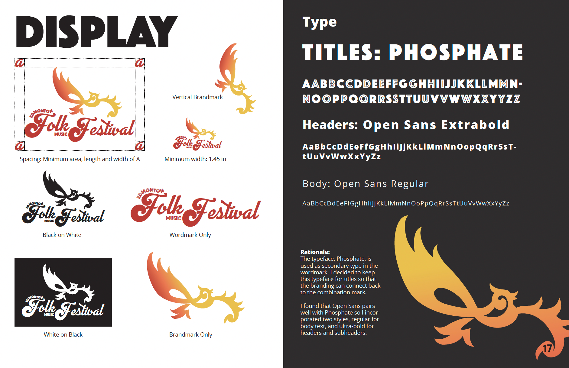
The main words “Folk Festival” combine the letter F from the Vintage Queens typeface by Putracetol Studio, with the gentler script typeface, Advertising Script by Ross Frederic George in bold, which helps add an artistic touch that feels almost personalized. The funky F’s bring in playful swirls of energy. The two fonts work together to create a wordmark that feels quirky. The secondary type, “Edmonton,” and “Music,” are in the typeface, Phosphate, published by Red Rooster Collection, in the inline style. Phosphate Pro is a bold and expressive all-caps sans serif font family, it is a typeface that feels exciting and happy.
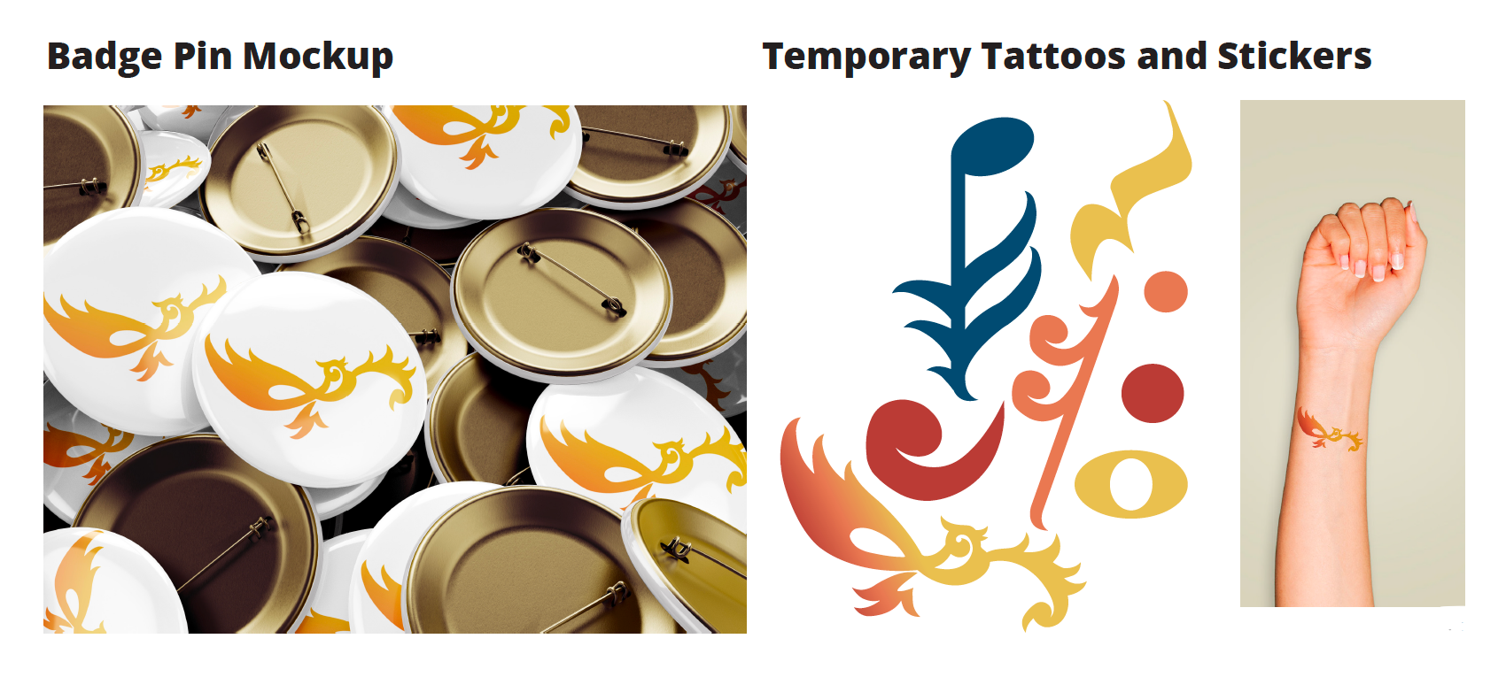
The brand mark represents a songbird. It is specifically modeled after a yellow warbler in flight, in combination with the iconic treble clef symbol. Yellow warblers are a type of songbird that inhabit Alberta, which really ties into the local, “Edmonton” aspect of the festival, while also representing the performers who, like songbirds, will play a musical song. As their namesake, yellow warblers are almost entirely yellow, but the males can have red streaks, so the full colored brand mark is a red-yellow gradient. Additionally, the brand mark is stylized to appear more folk-y and appeal to the culture of folk arts. The spikes on the wings were refined to match the right half of the bar in the letter F of the wordmark. The swirl making up the musical bird’s head was also built around the swirl of the F.
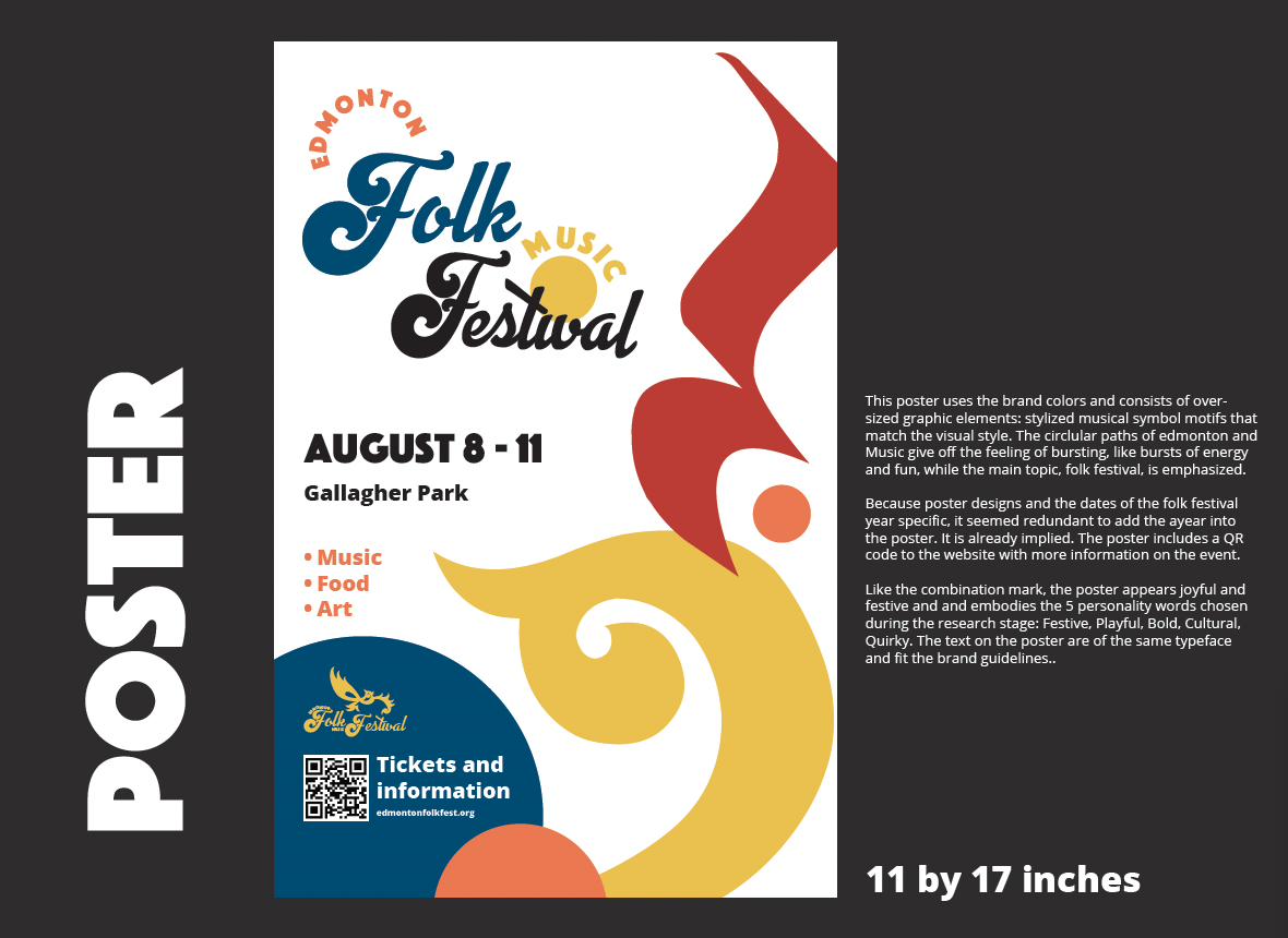
All together, the combination logo appears joyful and festive and in its own way embodies the 5 personality words: Festive, Playful, Bold, Cultural, Quirky.
Exhibition Marketing
Illustration and Advertisement
Collaboration with Kaye Rivera and Santiago Zamora
Full Project: https://www.figma.com/file/v25Yh2PPw2iDJTxf3cU20f/Presentation?type=design&node-id=0%3A1&mode=design&t=pvoaLpNUBz4cJB3K-1



Logo and Brand Design (Student Project)
Desn311- Branding and Identity Design
